

Alignment in a Markdown table comes down to where you put the colon in the separator row: a colon on the left (:---) left-aligns a column, colons on both sides (:---:) center it, and a colon on the right (---:) right-aligns it. This is the GitHub Flavored Markdown convention, and it works across most modern Markdown processors. Skip a colon entirely and the column defaults to left alignment. The examples and compatibility notes below cover the edge cases that trip people up.
TL;DR:
- To ensure correct table alignment, verify the number of pipes in the header and separator rows before adding colons for alignment.
- Use right alignment for numeric columns like prices or percentages to improve readability and facilitate quick comparisons.
- Test your Markdown tables in the actual platform you're publishing on, as some renderers may not support full GFM table alignment features.
- Keep separator dashes proportional to the column's content width for easier editing and better raw source readability.
- Avoid placing colons outside of the separator row, as it will display as a literal character and break your table formatting.
Table of Contents
- Markdown Table Alignment Examples You Can Copy and Paste
- What Actually Controls Alignment in a GFM Table
- Does Every Markdown Renderer Support Table Alignment?
- Choosing Left, Center, or Right Alignment for Readability
- Fixing a Markdown Table That Won't Align
- A Quick Note From Zack on Keeping Tables Readable
- The Real Lesson Buried in All This Syntax
- Sources
Markdown Table Alignment Examples You Can Copy and Paste
Every alignment option lives in the separator row, the line of dashes and colons directly under the header. Here's a left-aligned table:
| Task | Owner |
| :--- | :--- |
| Fix login bug | Priya |
| Update docs | Marcus |
Center alignment just doubles up the colons:
| Status | Priority |
| :---: | :---: |
| Open | High |
| Closed | Low |
And right alignment puts the colon on the far side, which is what you want for anything numeric:
| Item | Price |
| ---: | ---: |
| Widget | $12.50 |
| Gadget | $8.00 |
Real documents rarely use one alignment for every column. A changelog or pricing table usually mixes all three in a single row:
That mixed example is the one worth memorizing: left for the descriptive text, center for the short status label, right for the dollar figure. A few things about the syntax itself matter here:
- Outer pipes (the
|at the very start and end of each row) are optional in GFM, but including them makes the raw source much easier to scan. - Dash count is cosmetic.
:-works exactly the same as:-----on virtually every renderer that supports GFM table alignment. - If a cell needs a literal pipe character, escape it with a backslash (
\|) so the parser doesn't read it as a column break.
What Actually Controls Alignment in a GFM Table
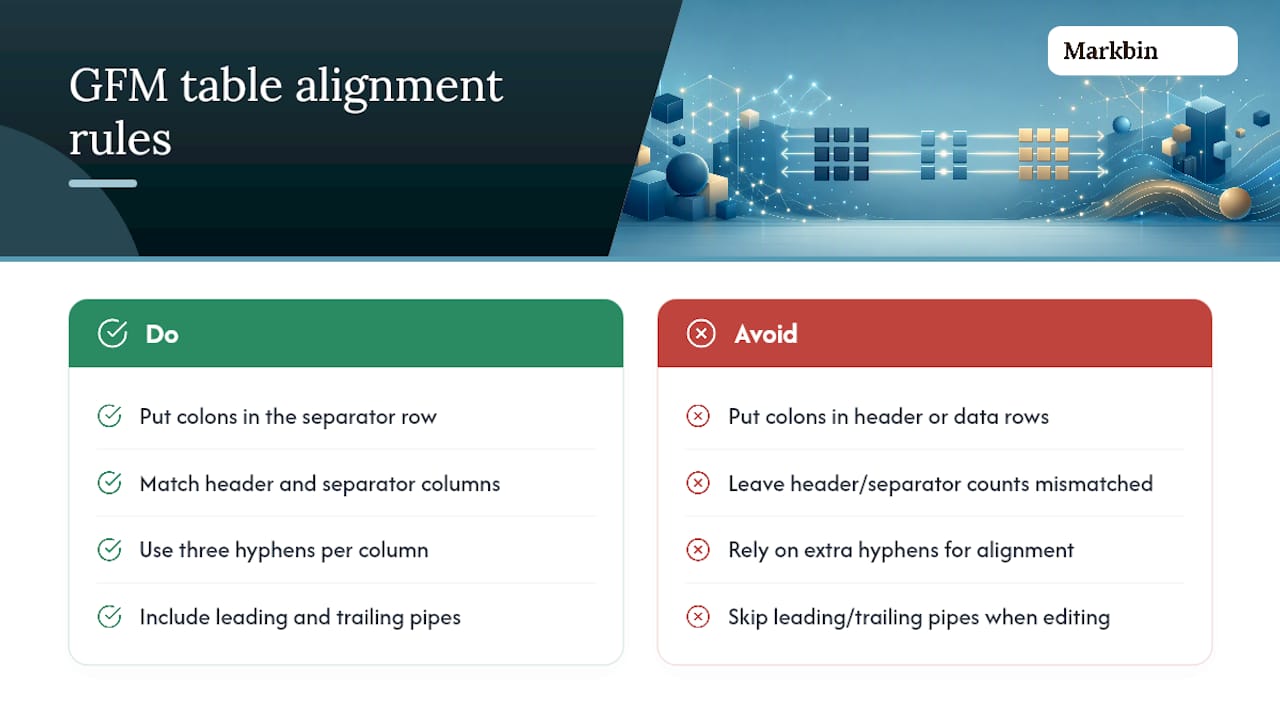
The separator row is the only place alignment markers do anything. Put a colon in the header row or a data row instead, and it just prints as a literal character. That single misunderstanding causes more broken tables than anything else in Markdown.
Two structural rules matter more than the colons themselves. First, the header row and the separator row need the exact same number of columns. GitHub's own formatting docs walk through this pipe-and-hyphen structure and note that mismatched counts are a common reason tables render as plain text instead of a table. Second, the number of hyphens per column is purely stylistic. One hyphen renders identically to ten on almost every engine, though three hyphens per column is the readability convention most style guides and linters expect.
Leading and trailing pipes fall into the same "doesn't affect rendering, but helps humans" category. Add them anyway. A table without them still renders fine in GFM, but it's noticeably harder to eyeball when you're scanning raw source in an editor.
Does Every Markdown Renderer Support Table Alignment?
Not every renderer does, and that's the single biggest source of confusion around this feature. GitHub, GitLab, Obsidian, and most static site generators built on remark or micromark all support the full GFM table extension, colons included. A handful of lightweight note apps and some import pipelines, Notion's Markdown import being a known example, don't fully honor alignment even when the rest of the table renders correctly.
When colons show up as literal characters in your output instead of triggering alignment, the cause is almost always the same: the renderer isn't running a GFM-aware table parser at all. It's treating your Markdown as plain text with some basic formatting, not the full extension set.
Before you publish anywhere, run through a short checklist:
- Preview the table in the actual platform you're publishing to, not just your editor.
- Confirm there's a blank line before the table. Some renderers silently ignore a table that follows text with no gap.
- Count the pipes in your header row against the pipes in your separator row. They should match exactly.
- If alignment still won't show up, test the same block in a known GFM renderer like GitHub's own preview to isolate whether the problem is your syntax or the platform.
If the target platform genuinely doesn't support alignment, your fallback options are a raw HTML table, an export pipeline that pre-renders the Markdown into HTML, or a tool that handles GFM tables natively before the content ever reaches the limited renderer. Some Markdown rendering engines follow the GFM spec, which is worth knowing if you've been burned by a renderer that quietly drops your alignment.
Choosing Left, Center, or Right Alignment for Readability
The alignment you pick isn't just cosmetic. It changes how fast someone can scan a table.
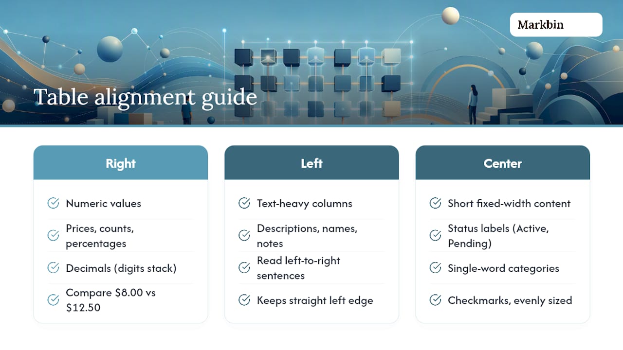
Right-align anything numeric, prices, counts, percentages, decimals, so the digits stack vertically. A column of right-aligned dollar amounts lets your eye compare $8.00 against $12.50 instantly, because the decimal points line up. Left-aligned numbers force you to read every digit individually. This is standard readability guidance for numeric data across most style guides, not a Markdown-specific quirk.
Left-align text-heavy columns, descriptions, names, notes, anything meant to be read left to right in normal sentences. Centering long text creates a jagged, uneven left edge that's genuinely harder to read line by line.
Center-align short, fixed-width content: status labels like "Active" or "Pending," single-word categories, checkmarks. Centering only looks clean when the content is short and roughly the same length across rows.
Pro Tip: Keep your separator dash counts roughly proportional to the column's actual content width. It changes nothing about how the table renders, but it makes the raw Markdown source dramatically easier for a collaborator to read and edit later.
Fixing a Markdown Table That Won't Align
When a table renders as plain text, or aligns wrong, work through these steps in order:
- Count the columns. Count the pipes in the header row, then count them in the separator row. A mismatch is one of the most common reasons a table fails outright, and the renderer falls back to treating the whole block as text.
- Check for a blank line above the table. Some processors require one; without it, the table block gets swallowed into the preceding paragraph.
- Verify colon placement. Colons belong only in the separator row. If you put them in the header or a data row, they'll print as literal characters instead of triggering alignment.
- Isolate the problem. Paste the exact same table into GitHub's web editor or another known GFM-compliant tool. If it aligns correctly there, the issue is your target platform's renderer, not your syntax.
A Quick Note From Zack on Keeping Tables Readable
Here's the habit worth building: write your raw table with consistent spacing so it's still readable as plain text before you ever hit preview. If you can't tell what a column means by squinting at the unrendered Markdown, a renderer bug will be the least of your problems.
Some Markdown rendering engines render full GFM tables, including alignment, exactly as GitHub does, so a table built and tested there behaves the same way elsewhere. For syntax that goes deeper than alignment, the Markdown tables syntax guide on a related blog covers the rest. Always preview before you publish.
The Real Lesson Buried in All This Syntax
Most guides to table alignment bury the useful part under a wall of syntax explanation, when the actual skill is deciding which alignment serves the reader, not memorizing colon placement — understanding why research tables need structure helps clarify the design choices involved. Once you've written it twice, :---, :---:, ---: stops being something you look up.
Where conventional advice falls short is treating alignment as purely cosmetic. It's not. A right-aligned price column is a readability decision, not a style preference, and a lot of technical writers skip it simply because they never learned the syntax was this short.
If you take one thing from this, prioritize testing your table in the actual renderer before you ship it anywhere. Syntax that's perfectly correct by the GFM spec can still render as broken plain text on a tool that never implemented the table extension in the first place. That gap between "correct Markdown" and "correctly rendered Markdown" causes far more frustration than the alignment syntax itself ever does. Get the preview habit right, and the colons take care of themselves.
— Zack