
Clean typography is the single most decisive factor in whether readers absorb your content or abandon it. Text accounts for roughly 80–95% of the visual surface area in most digital products, which means type choices shape nearly every pixel a reader sees. The industry term for this discipline is typographic hierarchy, and it governs how font size, weight, spacing, and structure guide the eye from headline to conclusion. Designers, content creators, and educators who understand why clean typography matters in content gain a measurable edge in readability, trust, and engagement.
Why clean typography matters for content readability
Readable content starts with a handful of measurable standards. Body text should maintain 50–75 characters per line with a minimum font size of 18px on desktop and 16px on mobile. Those numbers are not arbitrary preferences. They reflect decades of eye-tracking research showing that lines outside this range force the eye to work harder, which increases fatigue and reduces comprehension.
Whitespace is equally critical. Proper whitespace improves comprehension by up to 20%. That gain comes from reducing visual crowding, which lets the brain process each sentence before moving to the next. Tight spacing forces readers to re-read lines, which slows them down and raises the chance they will leave.
Line spacing, or leading, follows a similar logic. A line height of 1.4 to 1.6 times the font size is the accepted standard for body text in digital environments. Anything tighter collapses the visual breathing room that separates one thought from the next.
- Use a minimum of 18px for body text on desktop screens.
- Keep line length between 50 and 75 characters per line.
- Set line height at 1.4–1.6 times the font size.
- Maintain consistent paragraph spacing to signal structural breaks.
- Avoid full justification on screens, which creates uneven word spacing.
Pro Tip: Implement a baseline grid with consistent vertical rhythm across your layout. This approach reduces cognitive load and increases information retention, making it one of the most effective techniques you can apply to readable content formatting in 2026.
Well-set typography can improve reading speed by up to 20%. That improvement compounds across longer documents, meaning a well-formatted tutorial or lesson plan delivers meaningfully more value than the same content set in poor type.

How does typography affect brand trust and credibility?
Typography shapes perception before a reader processes a single word. 75% of users judge a company's credibility based on visual design, with typography as a primary factor. That statistic means your font choices are doing trust-building work the moment a page loads.
Typography affects brand personality more consistently than any other design element. Color can shift with trends. Illustration styles change. But the typeface you choose carries a persistent signal about who you are and how seriously you take your audience. Serif typefaces like Georgia or Times New Roman communicate tradition and authority. Sans-serif typefaces like Inter or Helvetica signal clarity and modernity. Neither is universally better. The choice must match the brand's actual voice.
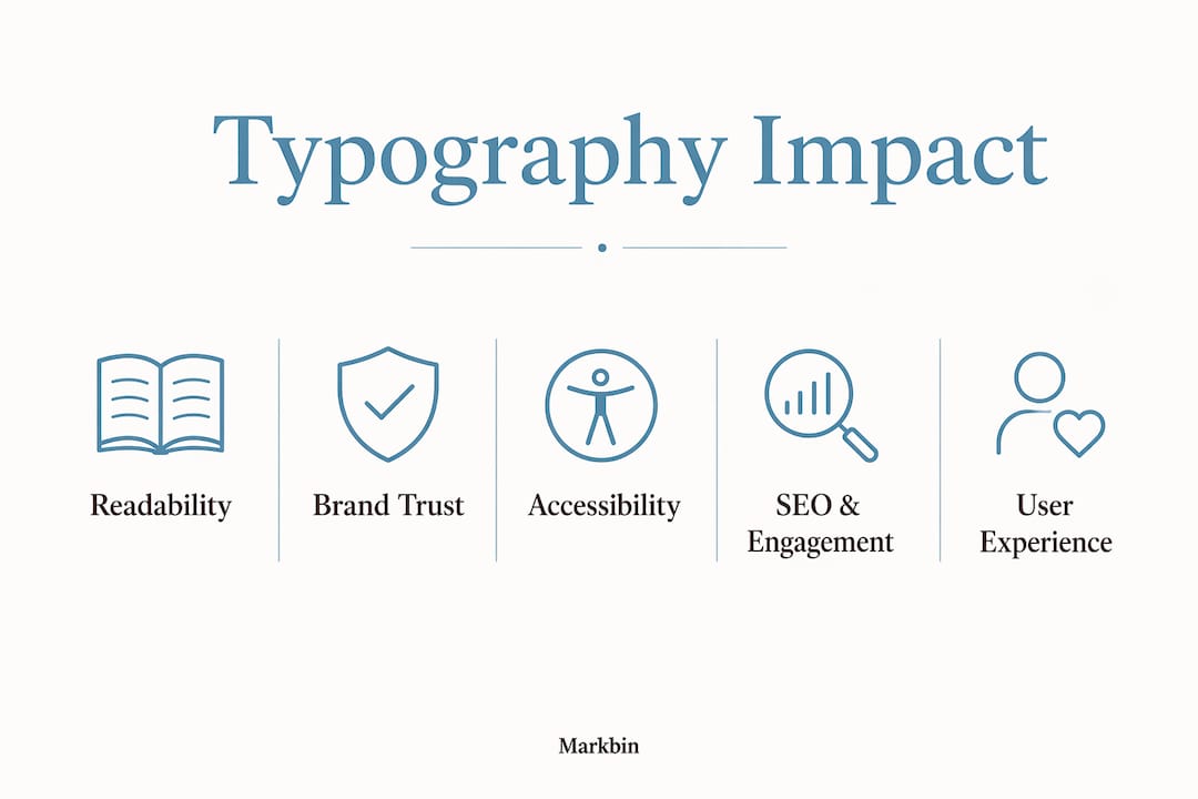
Hierarchy consistency is where most designers lose trust without realizing it. When heading sizes, weights, and spacing vary unpredictably across a site or document, readers sense disorder even if they cannot name it. Consistent hierarchy signals that someone thought carefully about the content, which translates directly to perceived professionalism. Consistent formatting in branding reinforces this effect across every touchpoint.
Choosing typefaces based on legibility rather than aesthetics alone is the defining discipline for high-performance brands. Aesthetics matter, but legibility is the non-negotiable foundation.
| Typography choice | Effect on user perception |
|---|---|
| Consistent heading hierarchy | Signals professionalism and editorial control |
| Serif body typeface | Suggests authority, tradition, and depth |
| Sans-serif body typeface | Communicates clarity, modernity, and approachability |
| Poor contrast or small font size | Reduces credibility and increases distrust |
| Mismatched type scales | Creates visual noise and signals carelessness |
How brand standards apply to digital screens reinforces this point: typographic consistency across channels is not a design preference. It is a trust mechanism.
What does typography do for accessibility and inclusive design?
Clean typography is as much about inclusion as it is about aesthetics. Poor typography disproportionately affects users with dyslexia, visual impairments, and cognitive differences. When designers ignore these readers, they exclude a significant portion of any audience from fully accessing the content.
The Web Content Accessibility Guidelines (WCAG) set the standard for accessible type. WCAG 2.1 requires a minimum contrast ratio of 4.5:1 for normal text and 3:1 for large text. These thresholds exist because low contrast is the most common barrier for readers with low vision or color perception differences.
Accessible typography practices include:
- Choose typefaces with clear letterform differentiation, avoiding decorative fonts for body text.
- Set a minimum body font size of 16px, with 18px preferred for long-form reading.
- Avoid all-caps body text, which reduces reading speed for most readers and is particularly difficult for users with dyslexia.
- Use left-aligned text rather than centered or justified text for paragraphs.
- Provide sufficient spacing between letters (tracking) and between lines to prevent visual crowding.
Dyslexia-friendly typefaces like OpenDyslexic or fonts with distinct letterforms reduce common letter-confusion errors. These choices do not compromise visual quality for other readers. They improve clarity for everyone.
The Americans with Disabilities Act (ADA) and Section 508 of the Rehabilitation Act both apply to digital content in many professional and educational contexts. Accessible typography is not optional for organizations subject to these standards. It is a legal and ethical requirement.
How does typography improve SEO and user engagement?
Typography functions as a technical signal for search engines, not just a visual one. Typography hierarchy acts as a technical API for AI systems, making it essential for SEO and search traffic in 2026. Search engines and AI indexing tools read heading structure, font sizing patterns, and content hierarchy to understand what a page is about and how authoritative it is.
Dwell time and bounce rate are the two user behavior metrics most directly affected by type quality. When text is hard to read, readers leave faster. When hierarchy is clear, readers scan, find what they need, and stay longer. Both outcomes feed directly into search ranking signals.
- Use a single H1 heading per page to define the primary topic clearly.
- Structure H2 and H3 headings to reflect the logical flow of your argument or lesson.
- Keep body font size at 16px minimum on mobile to prevent pinch-zooming, which increases bounce rate.
- Use bold and italic sparingly to highlight genuinely critical terms, not for decoration.
- Apply consistent type scale ratios (such as the Major Third or Perfect Fourth scale) to create a hierarchy that both readers and crawlers can parse.
Pro Tip: Semantic heading structures improve AI metadata parsing. A well-structured markdown headers hierarchy signals content organization to both search engines and readers, which directly supports dwell time and reduces bounce.
Responsive typography matters as much as responsive layout. Desktop users read at a distance; mobile users hold screens close. A type system that scales fluidly across breakpoints keeps the reading experience consistent regardless of device. Fixed font sizes that look fine on a 27-inch monitor become unreadable on a 5-inch phone screen.
Typography that calls attention to itself fails because it disrupts reading flow. The best typography disappears, letting the content carry the full weight of the message. That invisibility is the goal, and it is what separates functional type from decorative type.
Key Takeaways
Clean typography is the foundation of readable, trustworthy, and accessible digital content, and it directly shapes how readers, search engines, and AI systems interpret your work.
| Point | Details |
|---|---|
| Readability standards exist | Body text needs 50–75 characters per line and a minimum 16px font size to reduce reader fatigue. |
| Whitespace drives comprehension | Proper spacing improves user comprehension by up to 20%, making layout a content decision, not just a visual one. |
| Typography builds brand trust | 75% of users judge credibility through visual design, with typeface choice as the primary signal. |
| Accessibility is non-negotiable | WCAG 2.1 contrast and spacing standards protect readers with dyslexia, low vision, and cognitive differences. |
| Hierarchy signals SEO authority | Structured heading levels function as a technical API for AI indexing tools and search engine crawlers. |
Typography is the interface most designers underestimate
I have reviewed hundreds of digital products over the years, and the pattern is consistent. Teams spend weeks debating color palettes and icon styles, then ship body text at 14px with 1.2 line height and wonder why engagement is low. Typography is the invisible interface. It does not announce itself when it works. It only becomes visible when it fails.
The most counterintuitive lesson I have learned is that well-handled typography predicts perceived product quality more reliably than any other design element. Not the logo. Not the color scheme. The type. Readers cannot always articulate why one document feels authoritative and another feels amateur, but the difference almost always comes down to spacing, scale, and hierarchy discipline.
The mistake I see most often is treating typography as the last step in a design process. Designers finalize layout, add content, then adjust type to fit whatever space remains. That sequence produces exactly the kind of cramped, inconsistent type that kills engagement. Type should drive the layout, not fill it.
My practical advice is this: set your type scale and spacing system before you design anything else. Lock in your H1 through H4 sizes, your body size, your line height, and your paragraph spacing. Then build everything around those decisions. The result is a document or interface where every element has a clear visual relationship to every other element. Readers feel that coherence even when they cannot name it.
— Zack
Markbin makes typographic consistency effortless
Maintaining clean typographic hierarchy across documents is one of the hardest parts of content production at scale. Markbin solves this by converting plain markdown into beautifully rendered, shareable documents that apply consistent formatting automatically. Every heading level, code block, table, and list renders with the visual structure your readers expect, without manual styling on your part. Designers, educators, and content creators use Markbin to publish well-formatted content instantly, with no sign-up required. Whether you are sharing a technical tutorial, a lesson plan, or a collaborative document, Markbin preserves the hierarchy and spacing that make content readable and credible from the first line.
FAQ
What is clean typography in digital content?
Clean typography refers to the disciplined use of font size, spacing, hierarchy, and typeface choice to make text easy to read and understand. It prioritizes legibility and structure over decoration.
How does font size affect readability?
Body text below 16px on mobile and 18px on desktop increases reading fatigue and raises bounce rates. Larger, well-spaced text reduces the cognitive effort required to process each line.
Why does typography matter for SEO?
Heading hierarchy functions as a technical signal for search engines and AI indexing systems. Structured H1, H2, and H3 tags help crawlers understand content organization, which supports search ranking.
What typography standards apply to accessibility?
WCAG 2.1 requires a minimum contrast ratio of 4.5:1 for normal text and recommends left-aligned, adequately spaced type to support readers with dyslexia and visual impairments.
How many typefaces should a digital document use?
Most design standards recommend no more than two typefaces per document: one for headings and one for body text. Using more creates visual noise and weakens hierarchy.