Consistent formatting in branding is the disciplined use of color palettes, typography, layout, and spacing to create a unified visual identity across every customer touchpoint. The industry term for this practice is visual brand consistency, and it is one of the most measurable drivers of revenue and recognition available to brand managers. Consistent brand presentation can boost revenue by up to 33% and increase brand visibility 3.5 times compared to fragmented approaches. That number is not a soft marketing claim. It reflects what happens when customers recognize a brand instantly rather than spending cognitive energy figuring out who they are dealing with. Tools like Lucidpress, Frontify, and Monotype have built entire product lines around this single discipline because the financial case is that strong.
What does research say about the business impact of consistent formatting?
The evidence for consistent formatting as a revenue driver is specific and reproducible. Two-thirds of companies report at least a 10% lift in annual revenue directly tied to brand consistency. That figure comes from repeated exposure, which marketing researchers call the Rule of 7. The rule holds that a customer needs roughly seven consistent brand impressions before trust and recall solidify. Every formatting inconsistency resets that counter.
Typography alone carries measurable weight. Research by Neurons Inc. in partnership with Monotype found that precise typography increases message relevance by 13%, memorability by 10%, and trustworthiness by 9% within the first 50 milliseconds a user sees branded content. That is before a single word is read. Your formatting is already making an argument about your brand's credibility before your copy gets a chance.
Color consistency compounds these effects. A consistent color palette can increase brand recognition by up to 80%. That is not simply about aesthetics. Color is the fastest signal the brain processes, and when it is predictable across print, digital, and social formats, it builds the cumulative memory structure that turns browsers into buyers.
The table below summarizes the key data points brand managers should keep on hand when making the case for formatting investment internally.
| Metric | Finding | Source |
|---|---|---|
| Revenue impact | Up to 33% increase from consistent brand presentation | Adessi |
| Company-level revenue lift | 66% of companies report 10%+ annual revenue lift | Shopify/Lucidpress |
| Typography: relevance | 13% increase in message relevance | Neurons Inc. / Monotype |
| Typography: memorability | 10% increase in memorability | Neurons Inc. / Monotype |
| Color recognition | Up to 80% increase in brand recognition | Adessi |
These numbers belong in your next brand audit presentation. They shift the conversation from "we should look more consistent" to "inconsistency is costing us measurable revenue."
Is consistent formatting the same as making everything look identical?
No, and confusing the two is one of the most common mistakes brand teams make. Consistency means maintaining structured relationships among design elements, such as spacing ratios, typographic hierarchy, and color proportions, rather than making every asset look like a carbon copy. The industry term for this is visual grammar. When your visual grammar is intact, a social media post and a printed brochure can look quite different and still feel unmistakably like the same brand.
Rigid uniformity creates micro-friction. When teams try to make every asset identical regardless of format or context, they produce content that feels forced and fails to serve the medium. A LinkedIn post formatted exactly like a product data sheet will underperform both as a social asset and as a brand signal.
The distinction matters practically. Here is where brand teams get it right versus where they go wrong:
- Consistency principle: Maintain the same typeface hierarchy across all formats, even if point sizes vary by medium.
- Uniformity pitfall: Forcing the same font size on a billboard and a mobile notification.
- Consistency principle: Apply your primary brand color as the dominant accent across digital and print.
- Uniformity pitfall: Refusing to use secondary palette colors in contexts where the primary color reduces readability.
- Consistency principle: Use the same spatial logic (padding ratios, grid alignment) across templates.
- Uniformity pitfall: Locking templates so tightly that designers cannot adapt for accessibility requirements.
- Consistency principle: Treat typographic shifts as intentional repositioning signals, not aesthetic refreshes.
- Uniformity pitfall: Changing fonts ad hoc because a designer prefers a new typeface this quarter.
Pro Tip: Before approving any formatting change, ask one question: does this change the visual grammar, or does it just adapt it to a new context? If it changes the grammar without a strategic reason, reject it.
Typographic shifts signal strategic repositioning and must be intentional. Brands like IBM and Mailchimp have made deliberate typeface changes tied to repositioning strategies. Those changes worked because they were planned, documented, and rolled out across every touchpoint simultaneously.
What are the core components of consistent formatting for brand managers?
Visual brand consistency rests on four components: color, typography, layout, and templates. Each one operates differently, but all four must work together for the system to hold.
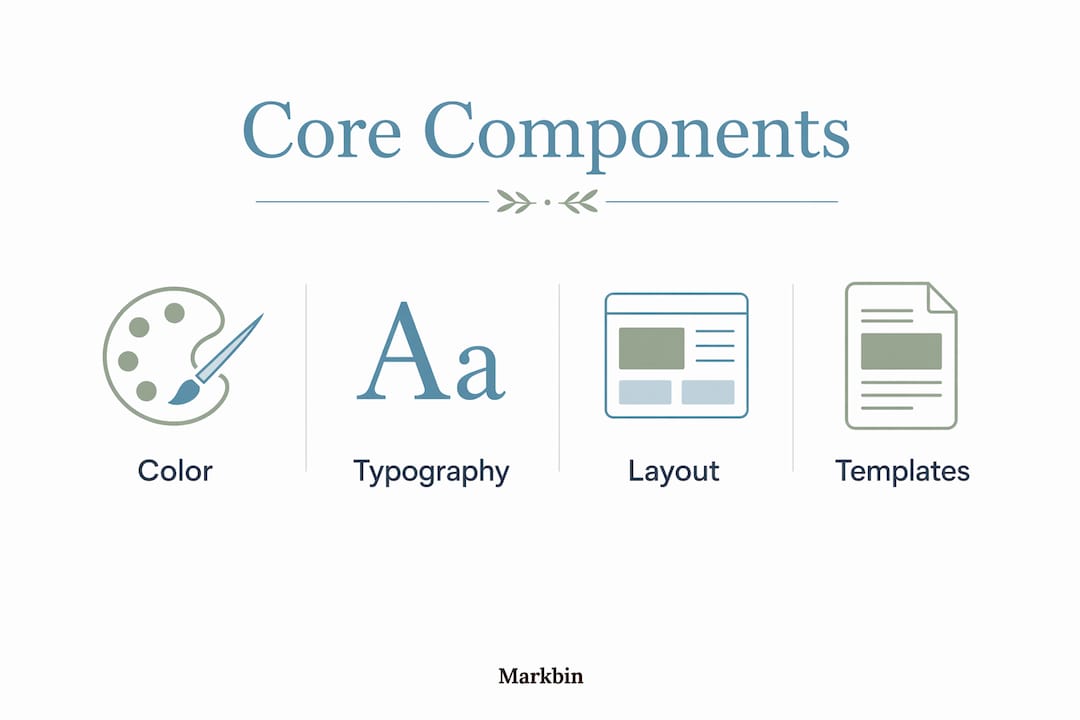
Color palettes
Color is the fastest brand signal and the easiest to get wrong at scale. An 80% increase in brand recognition from color consistency is achievable only when the palette is defined precisely, not just by name but by hex codes, Pantone references, and CMYK values for print. Vague guidelines like "use blue" produce drift. Precise specifications prevent it.
Typography
Typography carries emotional weight that most brand managers underestimate. Formatting decisions affect user perception of trust and price before any text is read. A serif typeface signals authority and tradition. A geometric sans-serif signals modernity and clarity. Neither is better. Both must be chosen deliberately and applied without exception across every brand asset.

Layout and spacing
Layout is the silent architecture of your brand. Consistent grid systems, margin ratios, and white space proportions create a visual rhythm that customers recognize subconsciously. When that rhythm breaks, something feels off even if the viewer cannot name why. Spatial hierarchy, meaning the consistent sizing and positioning of headlines, subheads, and body text, is what makes a brand feel organized and trustworthy at a glance.
Templates and living style guides
Templates are the most practical tool for embedding consistency into daily workflows. A living style guide and pre-formatted templates make consistent design the default action, turning brand guidelines from static documents into an operating system your team actually uses. Frontify, Canva for Teams, and Adobe Express all offer template-locking features that prevent off-brand formatting at the production level.
Pro Tip: Build your style guide as a living document with version history. When formatting standards evolve, teams need to know what changed, why it changed, and when the new standard takes effect. A static PDF does not do that job.
The table below shows what happens when formatting is inconsistent versus when it is managed as a system.
| Scenario | Inconsistent formatting | Consistent formatting |
|---|---|---|
| Customer recognition | Brand feels unfamiliar across channels | Instant recognition builds trust |
| Team efficiency | Designers rebuild assets from scratch | Templates reduce production time |
| Revenue impact | Fragmented identity reduces conversion | Up to 33% revenue increase |
| Brand perception | Signals disorganization | Signals authority and reliability |
| Onboarding new team members | Steep learning curve, high error rate | Style guide accelerates ramp-up |
How do you implement consistent formatting across digital and print media?
Implementation is where most brand consistency strategies fail. The strategy exists in a document. The execution happens across a dozen teams, three agencies, and two dozen content formats. Closing that gap requires a systems approach, not just better guidelines.
Here is a practical framework for embedding consistent formatting into your workflows:
-
Audit your current state. Pull 20 recent brand assets across channels and compare them against your style guide. Identify where drift has occurred and which teams or formats are the most inconsistent. You cannot fix what you have not measured.
-
Build a content style guide that covers formatting explicitly. Most style guides focus on tone and messaging. Yours should also specify typography rules, color usage by context, spacing standards, and image treatment guidelines.
-
Create format-specific templates. One template for social graphics, one for email headers, one for presentations, one for print collateral. Lock the elements that must stay consistent and leave flexibility only where the medium genuinely requires it.
-
Treat your style guide as a collaborative operating system. Frontify describes this approach directly: guidelines become the default environment your team works within, not a reference document they consult occasionally. Sharing presentation outlines and brand documents through a centralized platform reduces the ad hoc formatting decisions that cause drift.
-
Schedule quarterly formatting reviews. Brand consistency is not a one-time project. Markets shift, platforms change their display specifications, and teams turn over. A quarterly review catches drift before it compounds.
-
Assign formatting ownership. Someone on your team must own brand formatting standards. Without a named owner, guidelines erode through a thousand small decisions made by people who did not know the rule existed.
Pro Tip: The biggest source of formatting inconsistency is not bad intent. It is friction. When the on-brand template is harder to find than a blank document, people use the blank document. Make the right choice the easy choice by organizing your asset library around the formats your team uses most.
Consistent branding boosts client trust and conversion rates in ways that compound over time. Consumers perceive brands as patterns rather than discrete elements. Every consistent touchpoint reinforces the pattern. Every inconsistent one raises the cost of recognition.
Key takeaways
Consistent formatting in branding is a measurable revenue driver, not a design preference, and it requires systems, not just guidelines, to maintain at scale.
| Point | Details |
|---|---|
| Revenue impact is real | Consistent brand presentation can increase revenue by up to 33% and visibility by 3.5 times. |
| Typography works before copy does | Precise typography lifts trustworthiness by 9% and memorability by 10% within 50 milliseconds. |
| Consistency is not uniformity | Visual grammar means consistent relationships among elements, not identical appearance across formats. |
| Templates are the enforcement mechanism | Living style guides and locked templates make consistent formatting the default, not the exception. |
| Ownership prevents drift | Assign a named formatting owner and schedule quarterly reviews to catch inconsistency before it compounds. |
Why formatting is a strategic asset, not a design preference
I have reviewed brand audits for organizations that had excellent messaging strategies and completely inconsistent visual execution. The pattern is always the same. Leadership treats formatting as a design team concern, not a business concern. Then a consultant pulls the revenue data and everyone is surprised.
The Neurons Inc. and Monotype research changed how I think about this. The fact that typography affects trust perception in 50 milliseconds means your formatting is doing sales work before your sales team gets involved. That reframes the entire conversation. You are not spending money on design. You are investing in a conversion asset that operates at every customer touchpoint, around the clock.
The hardest part of maintaining consistency at scale is not the guidelines. It is the silos. Marketing creates one set of assets. Product creates another. A regional team adapts both without checking either. Six months later, the brand looks like it was designed by three different companies. The fix is not more rules. It is a shared system that makes the rules automatic.
My honest advice: stop treating your style guide as a document and start treating it as infrastructure. When formatting standards are embedded in templates, shared via a centralized platform, and owned by a specific person with authority to enforce them, consistency stops being aspirational and starts being operational.
— Zack
How Markbin helps brand managers maintain formatting standards
Brand managers who need to distribute style guides, share formatted templates, and keep teams aligned on visual standards will find Markbin built for exactly that workflow. Markbin converts markdown documents into beautifully rendered, shareable links instantly, with no sign-up required. You can publish a living style guide, lock it with password protection, and share it across your team in minutes. When standards update, you update the document and the link stays the same. Markbin supports GitHub Flavored Markdown, including tables, syntax highlighting, and task lists, so your formatting documentation looks as polished as the standards it describes. Start managing your brand formatting standards at Markbin.
FAQ
What is the role of consistent formatting in branding?
Consistent formatting in branding is the disciplined application of color, typography, layout, and spacing to create a unified visual identity. It builds customer recognition and trust by ensuring every touchpoint reinforces the same brand pattern.
How much revenue can brand consistency actually generate?
Consistent brand presentation can increase revenue by up to 33%, and two-thirds of companies report at least a 10% annual revenue lift tied directly to brand consistency.
What is the difference between brand consistency and uniformity?
Brand consistency means maintaining structured relationships among design elements, such as spacing ratios and typographic hierarchy, across formats. Uniformity means making every asset look identical, which creates friction and fails to serve different media contexts.
How does typography affect brand perception?
Typography affects trust and price perception before a single word is read. Precise typographic choices increase trustworthiness by 9% and memorability by 10% within the first 50 milliseconds of brand exposure.
What tools help enforce consistent formatting across teams?
Frontify, Canva for Teams, and Adobe Express offer template-locking features that prevent off-brand formatting. Markbin provides a fast way to publish and share living style guides as password-protected, always-current shareable documents.