Readable content formatting is the practice of structuring and styling text so readers can scan, understand, and engage with it quickly. The industry term for this discipline is typographic hierarchy, though most content professionals simply call it formatting for readability. Done well, it combines font choices like Arial and other sans-serif typefaces, subheadings, paragraph length, and white space into a system that guides the eye without friction. Tools like Grammarly and readability analyzers help writers audit these choices before publishing. This guide breaks down every element content creators, educators, and students need to format written work that people actually read.
What is readable content formatting, and why does it matter?
Readable content formatting is the set of decisions that control how text looks and flows on a page or screen. It covers font size, line height, paragraph length, heading placement, and the use of lists and tables. Each choice either reduces or adds cognitive friction for the reader.
Web users scan pages in F-shaped patterns, moving quickly across the top of a page and then down the left side. Subheadings and front-loaded keywords act as navigation markers that pull scanners into the content. Without them, even well-written text gets abandoned.

The business case for formatting is concrete. Skimmable formatting produces 47% lower bounce rates and can double time spent on page. That is not a minor improvement. It is the difference between content that converts and content that disappears.
Improving readability is not about simplifying your ideas. It is about reducing cognitive friction through better structure so even complex topics become accessible. A dense academic argument can be formatted for the web without losing a single idea.
What are the essential elements of readable content formatting?
Six elements define well-formatted content. Each one addresses a specific way readers interact with text on a screen.
Subheadings and paragraph length
Descriptive subheadings placed every 200–300 words increase time on page by 40%. They serve as a content roadmap, not just section titles. A reader who skims your subheadings should understand your argument without reading a single body paragraph.
Paragraph length works alongside subheadings. Short paragraphs of 2–4 sentences improve scroll depth by 25% by creating visual breathing room. Long blocks of text signal effort before the reader has decided the content is worth it.
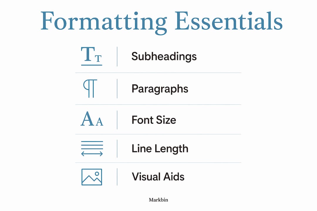
Font size, line height, and line length
The technical standards for comfortable web reading are specific. Font sizes of 16–18px, a line height between 1.4 and 1.8, and a line length of 50–75 characters prevent eye strain across devices. These are not aesthetic preferences. They are the result of decades of screen-reading research.
Line length matters more than most writers realize. Lines shorter than 50 characters feel choppy. Lines longer than 75 characters force the eye to travel too far, causing readers to lose their place and re-read lines.
Lists, tables, and visual aids
Bulleted lists for three or more items improve scannability by 47%. That number reflects how the brain processes grouped information differently from prose. When you list steps, features, or comparisons, you remove the reader's job of extracting structure from sentences.
Tables work best for direct comparisons and data. The table below shows how the core formatting elements map to their primary benefit:
| Formatting element | Primary benefit |
|---|---|
| Subheadings every 200–300 words | Navigation and time on page |
| Paragraphs of 2–4 sentences | Scroll depth and visual breathing room |
| Font size 16–18px | Reduced eye strain across devices |
| Bulleted lists for 3+ items | Scannability and comprehension |
| Line length 50–75 characters | Prevents eye fatigue and re-reading |
Pro Tip: Front-load every subheading and opening sentence with the most important word or phrase. Fast scanners decide in under two seconds whether a section is worth reading.
How does readable formatting differ across digital platforms?
Platform matters. A formatting approach that works perfectly in a long-form blog post can fail completely on a CMS with unpredictable rendering, a social media post with character limits, or a PDF exported from a word processor.
The most common formatting error content creators make is pasting text directly from Microsoft Word or Google Docs into a CMS. Pasting from word processors introduces hidden markup and spacing errors that break layout. The fix is simple: paste into a plain-text editor like Notepad or TextEdit first, then move the clean text into your CMS.
Markdown solves this problem at the source. Unlike rich text editors, Markdown vs rich text editors is a real workflow decision with formatting consequences. Markdown gives writers direct control over heading hierarchy, list structure, and spacing without hidden code. Rich text editors add formatting invisibly, which creates inconsistencies that are hard to diagnose.
Platform-specific quirks to watch for:
- CMS platforms like WordPress often strip or alter heading tags when content is pasted, breaking semantic HTML structure.
- Social media compresses formatting entirely, so front-loading the first sentence with the key claim becomes the only formatting tool available.
- Email clients render HTML inconsistently, making inline styles and simple table structures safer than complex CSS.
- PDFs exported from word processors preserve visual formatting but lose semantic structure, making them inaccessible to screen readers.
Tools like Grammarly and the Hemingway Editor flag readability issues at the sentence level, but they do not catch layout problems. A pre-publication visual review in the actual publishing environment is the only reliable check.
Why does consistent formatting matter for engagement and SEO?
Consistency in formatting is a baseline editorial standard. Inconsistent spacing, capitalization, and styling signal a lack of editorial care and lead directly to reader fatigue and abandonment. Readers notice when a heading style changes mid-article or when bullet spacing is irregular. They may not name the problem, but they feel it as distrust.
Accessible formatting extends your content's reach. Sufficient color contrast, readable font sizes, and logical heading hierarchy make content usable for readers with visual impairments or cognitive differences. A content style guide checklist helps teams maintain these standards across every piece they publish.
The SEO case for formatting is structural. Semantic HTML with clear heading hierarchies improves search engine understanding and supports accessibility technology. Google's crawlers read H1, H2, and H3 tags as signals of content organization. A page with a single H1, logical H2 sections, and supporting H3 subheadings communicates topic structure more clearly than a page with inconsistent or missing heading tags.
"Online readers rarely read word-for-word and rely heavily on subheadings as navigation; subheadings should be designed as a content roadmap, not just titles." — Ultimate 2026 Formatting Guide
The practical checklist for accessible, SEO-ready formatting:
- Use one H1 per page, followed by H2 sections and H3 subsections in logical order.
- Maintain a minimum font size of 16px for body text.
- Keep color contrast ratios at or above 4.5:1 for normal text.
- Write descriptive alt text for every image.
- Avoid using bold or italic as the only way to convey meaning.
What steps can content creators take to audit their formatting?
A formatting audit before publication catches the problems that hurt engagement most. The process does not require specialized software. It requires a systematic review against a short checklist.
- Run the breath test. Read every sentence aloud in a single breath. If you run out of air before the period, the sentence is too long. This technique catches awkward constructions that grammar checkers miss entirely.
- Check for walls of text. Scroll through your draft at arm's length. Any block of text that looks visually dense without a subheading or list nearby needs to be broken up.
- Strip hidden formatting. Paste any externally sourced text through a plain-text editor before adding it to your document. This removes stray HTML and invisible spacing characters.
- Audit heading hierarchy. Confirm you have one H1, that H2 headings divide major sections, and that H3 headings support H2 sections without skipping levels.
- Front-load key terms. Review the first sentence of every paragraph. The most important word or phrase should appear in the first five words.
The before-and-after difference is measurable. A paragraph that opens with "There are several reasons why formatting matters for digital content" buries the point. Rewritten as "Formatting directly controls whether readers stay or leave," it delivers the claim immediately.
Pro Tip: Build a two-minute pre-publication checklist in a shared document your team uses before every post goes live. Consistent process produces consistent output.
For educators and students, the same audit applies to academic writing shared digitally. A well-formatted essay or report signals the same editorial care that a well-formatted blog post does. Using Markdown for content writing is one of the fastest ways to build formatting discipline, because the syntax forces structural decisions upfront.
Key takeaways
Readable content formatting is the single most controllable factor between a piece of writing and the audience it is meant to reach.
| Point | Details |
|---|---|
| Front-load every heading and paragraph | Place the key claim in the first five words so scanners grasp it immediately. |
| Use technical font standards | Set body text to 16–18px with a line height of 1.4–1.8 for comfortable screen reading. |
| Subheadings every 200–300 words | Descriptive subheadings increase time on page by 40% and serve as a content roadmap. |
| Strip hidden markup before publishing | Paste externally sourced text through a plain-text editor to remove invisible formatting errors. |
| Consistent formatting builds reader trust | Irregular spacing and heading styles signal lack of care and increase abandonment rates. |
Formatting is a craft, not a checklist
I have reviewed hundreds of articles from writers who know their subject cold but lose readers in the first scroll. The problem is almost never the ideas. It is the presentation.
The misconception I see most often is that readable formatting means short sentences and simple words. That is not what the research shows. Limiting paragraphs to 2–4 sentences and average sentence length to 13–15 words improves comprehension by 15%, but it does not require you to remove nuance. You can write a sophisticated argument in short paragraphs. You cannot write a readable one in walls of text.
Visual hierarchy is the part most writers underinvest in. A reader's eye needs a path through the page. Subheadings, bold text, and lists create that path. When every paragraph looks identical, the eye has no anchor and the reader drifts. I have seen engagement metrics double on pieces where the only change was breaking up long paragraphs and adding two subheadings.
The uncomfortable truth about formatting is that it requires a separate editing pass. Most writers edit for language and then publish. Formatting deserves its own review, with fresh eyes, in the actual publishing environment. That single habit separates content that performs from content that sits.
— Zack
Format your content with Markbin
Markbin is built for writers who want clean, readable output without fighting their tools. The platform converts plain Markdown documents into beautifully rendered, shareable pages that preserve every formatting decision you make, from heading hierarchy to tables and code blocks. There are no hidden markup surprises, no CMS rendering quirks, and no sign-up required to start. For educators sharing lesson notes, developers writing documentation, or content creators drafting tutorials, Markbin removes the gap between how you write and how your audience reads. You can also explore Markdown table use cases to see how structured data presentation works in practice.
FAQ
What is readable content formatting in simple terms?
Readable content formatting is the practice of structuring and styling text so readers can scan and understand it quickly. It includes font size, paragraph length, subheadings, and the use of lists and white space.
What font size is best for web content readability?
A font size of 16–18px with a line height between 1.4 and 1.8 is the standard for comfortable screen reading. These settings reduce eye strain and work across desktop and mobile devices.
How often should I use subheadings in an article?
Place a descriptive subheading every 200–300 words. Research shows this frequency increases time on page by 40% and helps readers navigate content without reading every word.
Does formatting affect SEO rankings?
Semantic HTML with a clear H1, H2, and H3 heading hierarchy improves how search engines understand and index your content. Proper heading structure also supports screen readers, which broadens your content's reach.
How do I fix hidden formatting errors from copy-pasting?
Paste externally sourced text into a plain-text editor like Notepad or TextEdit before moving it into your CMS or document. This strips invisible HTML and spacing characters that break layout and create visual inconsistencies.