
Visual formatting is one of the most direct levers technical writers and educators have for improving how people actually use instructions. Done well, it cuts confusion, speeds task completion, and keeps readers from abandoning a document halfway through. Done poorly, it creates noise that competes with the content itself.
The core functions of visual formatting in instructions come down to three things:
- Clarity and skimmability: Breaking text into labeled chunks lets readers locate the step they need without reading everything around it.
- Cognitive load reduction: Typographic cues like bold text, numbered lists, and headers offload mental work by signaling structure before the reader processes a single word.
- Motivation and context: A well-formatted page looks approachable. A wall of dense text signals effort before the reader even begins.
What types of visual elements belong in instruction documents?
Each visual type does a specific job. Using the wrong one for the task wastes space and confuses readers.
- Numbered lists work for sequential steps where order matters. Readers can track progress and return to a specific step without losing their place.
- Bulleted lists suit parallel items with no fixed order, such as a list of required materials or supported file formats.
- Tables organize comparative data or multi-attribute information. The NIH Plain Language guidelines note that tables make complex information easier to understand by showing relationships without heavy prose.
- Action diagrams show how parts move or attach, not just where they end up. Research from Columbia University's Teachers College confirms that action diagrams outperform static structural diagrams for assembly and procedural instructions.
- Annotated screenshots pinpoint exactly where a reader should click or look, removing ambiguity that text alone cannot resolve.
- Charts and infographics communicate trends, proportions, or relationships that would take paragraphs to describe in prose.
| Visual element | Best use case | What to avoid |
|---|---|---|
| Numbered list | Sequential steps | Using when order does not matter |
| Table | Comparisons, multi-attribute data | Overloading with too many columns |
| Action diagram | Assembly, process steps | Switching viewing angles mid-sequence |
| Annotated screenshot | UI navigation, software tasks | Outdated screenshots after product updates |
| Chart or infographic | Trends, proportions | Replacing explanatory text entirely |
How white space, layout, and typography shape readability
Readers rarely read instructions word for word. They scan. Nielsen Norman Group research confirms that readers focus on summaries, bullet points, callouts, and white space to locate critical information efficiently. Your layout either supports that behavior or fights it.
White space is not empty space. Margins, line spacing, and section breaks isolate critical steps so they register as distinct units rather than blending into surrounding content. Crowded pages feel harder before the reader processes a single sentence.
Visual hierarchy tells readers which information matters most and in what order to process it. A consistent modular type scale, where heading sizes follow a ratio like 1.25 or 1.618, creates clear distinction between levels without requiring the reader to consciously analyze the structure. Smashing Magazine's visual hierarchy guide recommends using design tokens for color and font weight to prevent hierarchy from breaking down across a long document.
Typography choices carry more weight than most writers realize. Bold text catches a skimming eye; italics work for new vocabulary or definitions. The NIH recommends choosing fonts for readability rather than style, and using typographic variation deliberately rather than decoratively. For a deeper look at how these choices play out in digital content, the Markbin guide on clean typography covers heading structure and list formatting in practical terms.

Pro Tip: Run the squint test on your finished layout. Blur your eyes or squint at the page. If the most important element does not stand out immediately, your hierarchy needs work. This technique, sometimes called the squint test, quickly exposes cluttered or flat formatting before a reader ever sees it.
How to integrate visuals with text without creating confusion
Visuals should supplement explanatory text, not replace it. The University of Pittsburgh's Department of Communication puts it plainly: visual aids are lampposts to illuminate, not crutches to lean on. A diagram without a text reference leaves readers guessing what to look at and why.
Common mistakes that undercut instructional clarity:
- Decorative images that add visual interest but carry no instructional meaning. They lengthen load times, especially on mobile, and dilute the document's focus.
- Perspective shifts in diagrams. Cognitive research shows that changing viewing angles abruptly between steps increases cognitive load and causes errors.
- Uncaptioned visuals. A figure without a label or reference in the body text forces readers to guess its relationship to the surrounding content.
- Mismatched scale or proportion in part diagrams, which makes it impossible to judge real-world size relationships.
Best practices that actually work:
- Reference every visual explicitly in the text immediately before or after it appears.
- Use callouts and annotations to direct attention to the specific area of a diagram that matters for the current step.
- Prefer informational visuals that do the work of clarifying a difficult step over images that merely illustrate the finished product.
Pro Tip: Before adding any image, ask one question: does this visual make a specific step clearer, or does it just make the page look less empty? If the answer is the latter, cut it.
What research says about the impact of visual formatting on learning
The evidence for visual formatting's effect on instruction quality is consistent across decades of cognitive research.
Human learning is predominantly visual. Combining visuals with verbal explanation improves retention/01%3A_Chapters/1.10%3A_Visual_Aid) over several days compared to verbal explanation alone. That gap grows wider for complex procedural tasks.
Typographic cueing, specifically bolding, headers, and lists alongside graphic displays, reduces errors and speeds up task execution in procedural instructions. The formatting does not just make content look organized. It changes how quickly and accurately people perform the task.
Instructions rated highest by users share a consistent set of features: step-by-step action diagrams, explicit ordering, visible part attachment, and arrows or guidelines indicating motion. Instructions rated lowest had no diagrams, poor proportions, and missing steps.
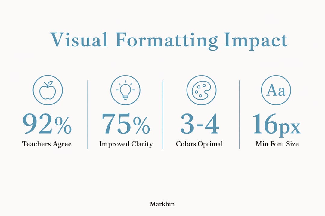
Research on visual aids in educational settings found that 92% of teachers and students agreed that visual aids increase direct experience and observation, while 82% agreed they save time in lesson preparation. Those numbers reflect a consistent pattern: well-designed visuals reduce the cognitive work required on both sides of instruction.
Accessibility considerations every technical writer needs to address
Accessible visual formatting is not a separate concern from good formatting. It is the same concern applied to a wider range of readers.
Color contrast is the most commonly overlooked issue. Roughly 8% of men and 0.5% of women have some form of color vision deficiency, according to the National Eye Institute. Never use color alone to convey meaning. A red warning label that relies solely on hue will be invisible to a reader with red-green color blindness. Pair color with a text label, icon, or pattern.
Alt text for images is required for screen reader users and also improves SEO. Write alt text that describes what the image communicates, not just what it depicts. "Diagram showing bolt insertion into slot A before tightening" is useful. "Assembly diagram" is not.
Heading structure matters for screen readers, which use heading levels to navigate documents. An H3 that appears before an H2 breaks that navigation. Keep heading levels sequential and meaningful, not decorative.
Font size and line spacing affect readers with low vision. Body text below 16px in digital documents creates friction for a meaningful share of your audience. Line spacing at 1.5 or higher reduces visual crowding without requiring larger fonts.
For developers building documentation systems, the Gyrence guide on unstructured HTML covers how poor markup structure breaks both accessibility tools and automated agents that parse instructional content.
How color theory improves instructional comprehension
Color in instructions works best as a system, not a decoration. Three principles from color theory apply directly to technical documentation.

Contrast ratios determine legibility. The Web Content Accessibility Guidelines (WCAG) 2.1 set a minimum contrast ratio of 4.5:1 for normal text against its background. Most default gray-on-white body text passes; light blue on white often does not.
Color as a semantic signal means assigning consistent meaning to each color across a document. Blue for notes, yellow for cautions, red for warnings. Once a reader learns the system in step one, they process color-coded callouts faster throughout the rest of the document.
Limiting the palette prevents visual noise. Three to four colors in a document are enough to create hierarchy and signal meaning. Beyond that, each additional color competes for attention rather than directing it. A grayscale pass, printing or viewing the document without color, reveals whether your layout still communicates structure when color is removed.
Real examples of visual formatting improving learning outcomes
The Stanford Human-Computer Interaction Group published research on automated assembly instructions that tested action diagrams against static structural diagrams. Instructions using action diagrams with dotted lines and arrows indicating part motion produced significantly better comprehension and fewer assembly errors than instructions showing only final positions.
A study published in the Journal of Technical Writing and Communication found that typographic cueing in procedural instructions, specifically bolding key terms and using numbered steps, measurably improved both performance time and accuracy on complex tasks compared to unformatted prose versions of the same instructions.
In classroom settings, research published through ERIC found that visual aids help in clarification of content for 75% of students and teachers surveyed, while 70% agreed that visual aids improve motivation. These are not marginal effects. They reflect a consistent pattern across procedural, educational, and technical contexts.
Tools that help you create effective visual formatting
The right tool depends on your output format and workflow.
For markdown-based documentation, Markbin renders GitHub Flavored Markdown with full support for tables, syntax highlighting, task lists, and math formulas. It produces shareable, visually formatted documents instantly, with no sign-up required, making it practical for technical writers who need to publish formatted content quickly and securely. The platform's visual markdown guide covers how to apply formatting principles directly within a markdown workflow.
For diagram and process visualization, Lucidchart and draw.io both support action diagram creation with annotation tools. draw.io is free and integrates with Confluence and Google Drive.
For accessibility checking, the WebAIM Contrast Checker validates color contrast ratios against WCAG 2.1 standards. Axe DevTools runs automated accessibility audits on HTML-based documentation.
For layout and print documentation, Adobe InDesign and Affinity Publisher support master page templates, paragraph styles, and style guides that enforce consistent visual hierarchy across long documents.
For screen-based instructional content, Figma's prototyping tools let you test layout and hierarchy decisions before committing to a final format.
Key Takeaways
Visual formatting in instructions directly improves task accuracy, reading speed, and retention by reducing cognitive load through structured layout, typographic hierarchy, and purposeful use of visuals.
| Point | Details |
|---|---|
| Action diagrams outperform static ones | Diagrams showing part motion and attachment reduce errors more than diagrams showing only final positions. |
| Typographic cueing speeds task execution | Bolding, headers, and numbered lists measurably improve both performance time and accuracy in procedural instructions. |
| White space is a structural tool | Margins, line spacing, and section breaks isolate critical steps and reduce visual crowding for scanning readers. |
| Color needs a system, not just variety | Assign consistent semantic meaning to each color and limit the palette to three or four to prevent visual noise. |
| Accessibility is built-in, not added on | Alt text, sequential heading levels, and sufficient contrast ratios serve all readers, not just those with disabilities. |